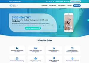
by teamdev | Mar 16, 2022
Our client approached us asking for a website that houses two practices. They already have content from their old sites, and they even provided reference sites for us to use to design a new site. They did not provide a logo at first, but we used a temporary logo as a placeholder.
We had to transfer a lot of content from their old sites to the new site we built. Our team also had to wait for the new content they wished to add to the new site. Building a site that houses two practices was not easy because we had to ensure that both clients liked the same site.
We had to use the reference sites the clients provided to create a website that both clients would like. The content they gave us was also posted on the site. Thanks to our design, the site was shown in a clean and informative way. We thought about the users and decided that we wanted to design the site in a way that the users can find what they need for both practices immediately.
The users will be able to find everything they need from the two practices quickly because we strategically placed important info on the site. Contacting both practitioners is also easy because the contact info can be found easily. The design we made also makes it easy for users to book a consultation and appointment.
Aa
Poppins Regular 35pt
Poppins Regular 30pt
Poppins Regular 16pt
Vestibulum ante ipsum primis in faucibus orci luctus et ultrices posuere cubilia Curae; Donec velit neque, auctor sit amet aliquam vel, ullamcorper sit amet ligula. Cras ultricies ligula sed magna dictum porta. Mauris blandit aliquet elit, eget tincidunt nibh pulvinar a. Sed lectus nibh.
See how we dealt throughout our client’s distinct concerns and implemented our methods to ensure their online presence and influence grew every day.
by teamdev | Jul 23, 2021
Our client is a creative agency that connects commercial partners with their audiences through amazing visuals. They want us to help them engage with their clients and coworkers for a harmonious collaboration that satisfies all parties. Our clients knew that it was time for a change because they used the old website architecture of HTML. They hired us to help them showcase their work on a new modernized site with a new design that resonates with the times.
We knew that the entirety of their old site had to be discarded because nobody uses HTML anymore. Our team had to pick and choose a new site architecture to make our client’s vision a reality. They also wanted us to stick to something similar to their old design, which was simple but elegant. Modernizing the site required our team to include features such as mobile responsiveness, fast loading speeds, high-resolution images, and animated transitions. Finally, we needed to figure out a way to blend their logo into their new design.
Our team decided to create a brand new website using WordPress for the site’s architecture. WordPress was used because we knew that it was easy for the client to handle, and it is compatible with a great many plugins to help our client. Our team can also easily download custom plugins to help the client’s website perform any task the client desires. If all else fails, our team can create custom-made plugins if necessary.
Our team built a website compatible with devices such as phones and tablets because we knew many potential clients use these devices to search for creative services. Next, we needed to optimize the high-resolution images to ensure faster loading times for pages. One of the last things we did was include animated transitions to the pages to help present our client’s amazing work.
We needed to use the old color palette while maintaining the old site’s basic structure because we were simply asked to modernize their site. Our team also did some graphic design to help blend our client’s logo with the work section page.
We built a site with all the modern features visitors expect from a digital agency, but we still kept the client’s identity by keeping the old design and color palette. All the high-resolution images and assets were optimized for the fastest loading times possible. We also animated the presentation of the client’s work to add an artistic touch to the presentation. The website we built allows our client to put their best foot forward for their clients.
Aa
Poppins Regular 32pt
Poppins Regular 24pt
Poppins Regular 16pt
Poppins Bold 14pt
Vestibulum ante ipsum primis in faucibus orci luctus et ultrices posuere cubilia Curae; Donec velit neque, auctor sit amet aliquam vel, ullamcorper sit amet ligula. Cras ultricies ligula sed magna dictum porta. Mauris blandit aliquet elit, eget tincidunt nibh pulvinar a. Sed lectus nibh.
See how we dealt throughout our client’s distinct concerns and implemented our methods to ensure their online presence and influence grew every day.
by teamdev | Jul 23, 2021
Our client already had an existing website, but its current state had a few issues that needed to be fixed. We noticed their website lacks content and information, which makes navigation difficult for visitors. Our client had minimal information on their homepage and only had a menu at the top of their homepage that linked to other pages. We also found that many of their images were not in high resolution and that their descriptions were short. Essentially, our team found that their site was disorganized and lacks content, which may make navigation difficult for the visitors.
Our team’s audit of the site showed us that it ran on outdated architecture. This presented many issues for the user experience that we needed to address. We found that the site was not responsive when using certain devices such as the phone and tablet. Our team found that the layout was distorted and accompanied by slow loading times when visiting the site through these devices. This was really bad for our client because most people like to book appointments through their phones.
Our team also found that the photos on the site were not in high resolution or optimized. This presents another problem the team had to fix because these kinds of images can slow down loading times while appearing distorted. Our client wanted to use the old photos for the new site, so we needed to transfer them all to the new site while making them look good. We had to do all of this while working within the confines of the client’s original site design.
Our team came together to create a new website. We had to work within the confines of the original design but improved user interface design, layout, and functionality by adding content and fixing the layout.
Next, we needed to start building the site. Our team decided that organization was key to improve the visitor experience. We wanted to create intuitive navigation to help visitors find what they’re looking for at a glance. The first thing our team did was add more content to the site and pepper in links in the text to make for easier navigation.
Finally, we had to create a new layout while keeping the design of the old website. Our team laid out the new content with the old pictures using design principles so that people could find what they needed at a glance. We had to resize the photos to make them look good despite them not being in high resolution. Our redesigns helped make navigation for visitors smoother while providing more information to the visitors.
Our team’s addition gave the site an upgrade when it comes to the visitor experience. The many different links to pages we set up allows users to navigate the site better. We also added some additional content to provide visitors with additional information that is found in most other lodging sites to keep them competitive.
We also made it easier to book appointments, contact the establishment, find out the amenities and write reviews. We have redesigned the site to provide a seamless experience that will keep visitors coming back.
Aa
Cormorant Regular 32pt
Cormorant Regular 24pt
Cormorant Regular 16pt
Cormorant Bold 14pt
Vestibulum ante ipsum primis in faucibus orci luctus et ultrices posuere cubilia Curae; Donec velit neque, auctor sit amet aliquam vel, ullamcorper sit amet ligula. Cras ultricies ligula sed magna dictum porta. Mauris blandit aliquet elit, eget tincidunt nibh pulvinar a. Sed lectus nibh.
See how we dealt throughout our client’s distinct concerns and implemented our methods to ensure their online presence and influence grew every day.
by teamdev | Jan 13, 2021
The team found a client that needed a site to market their COVID-19 testing kits to sell them.The client did not know what they wanted the website to look like or how it should be designed.
The biggest challenge the team faced was the time limit. The client wanted a website up and running immediately to sell the tests. Another obstacle the team faced was the lack of a design because the client did not know how they wanted the site to look and operate. The client did not like any of the templates from WordPress, which forced the team to make the site from scratch.
The team prioritized this task to get it done quickly. WordPress was used because of its architecture that comes with numerous templates and plugins. Since none of the themes from WordPress were approved by the client, the team needed a different way to design the site. The team decided to use static images and adjusted the contrast while adding graphics to create the site’s design.
The website uses optimized images for quick loading times. All the information about the test is written clearly. The information is broken into small digestible paragraphs to help visitors understand the product.
Aa
Open Sans Regular 32pt
Open Sans Regular 24pt
Open Sans Regular 16pt
Open Sans Bold 14pt
Vestibulum ante ipsum primis in faucibus orci luctus et ultrices posuere cubilia Curae; Donec velit neque, auctor sit amet aliquam vel, ullamcorper sit amet ligula. Cras ultricies ligula sed magna dictum porta. Mauris blandit aliquet elit, eget tincidunt nibh pulvinar a. Sed lectus nibh.
See how we dealt throughout our client’s distinct concerns and implemented our methods to ensure their online presence and influence grew every day.


Recent Comments