Why The Future Is Dark (Mode): The Case for Smarter UI

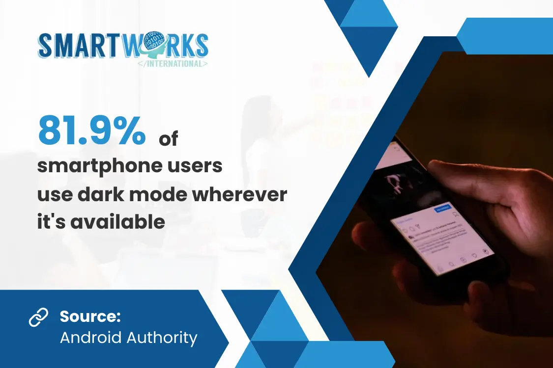
Dark mode has exploded in popularity over the past few years. What started as a sleek, stylish UI option has evolved into a core feature across apps, operating systems, and websites. Whether you’re on Instagram at midnight, coding in VS Code, or browsing Spotify, chances are you’re seeing light text on a dark background.
But is this shift toward the dark purely about the vibes? Or is there a real UX strategy behind the growing trend? It’s both.
In this blog, we’re breaking down the key reasons why dark mode isn’t just a visual trend, but a smarter, more user-friendly choice for the digital age.
What Is Dark Mode?
Dark mode refers to a user interface (UI) setting where light text, icons, and visual elements are presented on a dark background—usually black, dark gray, or navy blue. It flips the conventional design of black text on a white screen, aiming to offer a more comfortable visual experience, especially in low-light environments.
Twitter, now known as X, first introduced dark mode for Android users back in 2016. Since then, the feature has been widely adopted across major platforms and operating systems. Today, dark mode is available on iOS, Android, Windows, and macOS, as well as on popular websites like YouTube, Reddit, and X.
Many of these platforms now offer automatic dark mode switching based on time of day or ambient light settings.
Why Users Love Dark Mode
Dark mode isn’t just a passing trend—it’s become a default setting for millions of users across devices. But what’s driving this widespread preference?
It turns out, there’s more to it than just aesthetics. From eye comfort to energy savings, users are finding real benefits in the shift to darker interfaces. Here’s why so many people are embracing the dark:
1. Reduced eye strain. A study in Applied Ergonomics found that dark backgrounds are easier on the eyes, especially in low light. Unlike bright white screens, dark mode reduces glare and discomfort during extended use.
2. Improved focus. Dark mode is often perceived as cleaner and more minimalistic, helping users to focus better on the content at hand. This can be particularly useful in professional environments, coding platforms, and productivity apps.
3. Enhanced battery efficiency. On OLED screens, where each pixel emits its own light and black pixels are turned off, dark mode can be much more efficient. Tests show up to 30% more battery life, and even up to 63% on OLED displays.
How to Use Dark Mode In Design
Dark mode is a powerful tool, but it requires careful design to ensure a seamless and optimal user experience. Here are a few best practices to keep in mind:
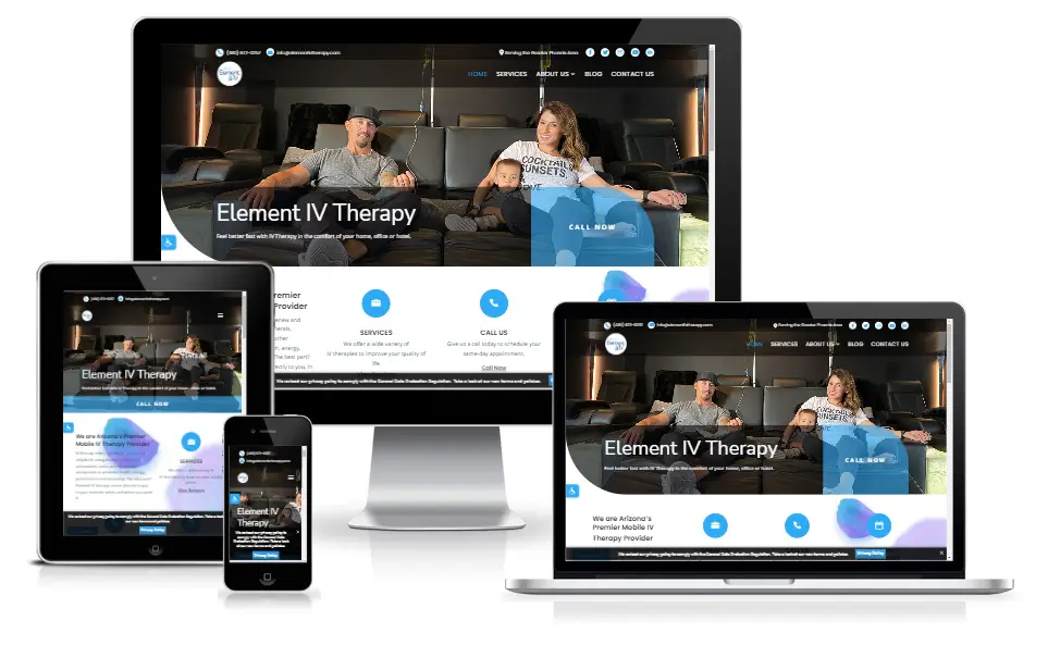
At Smart Works International, we implement these best practices in our designs. For example, our websites feature an Accessibility Tool that allows users to toggle dark mode across pages. This flexibility ensures that users have a seamless and comfortable experience, regardless of how or when they browse.

Take a look at how we implemented this for one of our client websites.
Designing for both dark and light modes is quickly becoming best practice in web and app development. CareerFoundry notes that flexible, responsive UI designs that adapt to different viewing conditions lead to higher engagement and retention rates.
Get Dark Mode Done Right with Smart Works
At Smart Works International, we don’t just follow trends—we strategize around them. Whether you’re building a website, revamping a mobile app, or running a digital marketing campaign, we help you create interfaces that look good and work well in any mode.
Our team builds adaptive designs that support both dark and light themes, ensuring optimal readability, accessibility, and visual impact, regardless of the setting your users choose.
So if you’re ready to upgrade your UX and tap into what today’s users actually want, drop us a message and let’s build something smart together.
Sources
Web Development; Lifted from
https://careerfoundry.com/en/blog/web-development/
Dark Mode; Lifted from
https://www.interaction-design.org/literature/topics/dark-mode?srsltid=AfmBOornmjziVmeBcyp7Y32couGLuxtzJesBpdz5CRUf6wv95R5Fb6FK
25 Top Web Design Trends; Lifted from
https://www.theedigital.com/blog/web-design-trends
35 Dark Mode Statistics You Need to Know; Lifted from
https://forms.app/en/blog/dark-mode-statistics
Get In Touch
Let's start building your dream website! Send us your contact information and an overview of your exciting ideas and we'll build it together. We can't wait to hear from you!
